Ideas I love #3: Visual Editions
For the second time in two years Christmas was a little quieter than ‘normal’.
Thankfully this period of relative quiet provided me with plenty of opportunity to read. I’ve actually come back to my desk in the new year feeling pretty refreshed and dare I say it, inspired. I have begun John Le Carre’s Silverview and I’ve enjoyed ploughing through Charlie Porter’s What Artists Wear.
I’m incredibly guilty of two things where books are concerned.
Firstly, I buy far more than I read.
Secondly, I have a very low tolerance for books I’m not enjoying. I have no qualms about ‘the sunk cost’ that might be involved in getting 50-60% of my way through a book and will stop reading something if my enjoyment starts to wane. One such book was Don Quixote. It is obscenely long - being shaped like a brick - and, despite it’s status as a classic, it bored me to tears. The same joke told over and over again. I pulled the plug after 400 or so pages.
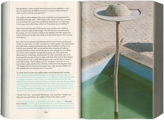
Revisiting my book shelves over the Christmas break, I had cause to take down my copy of Cervantes’ novel. The copy I own was published in 2015 and is a thing of beauty. This installment of Ideas I love is less about an idea - and more about a company - Visual Editions, who published this particular version of the novel.
Beautiful design work incorporating text effects and striking imagery serve to accentuate and enhance the content of a novel such as Quixote (they also published a novel by Jonathan Safran Foer and a version of The Life and Opinions of Tristam Shandy, Gentleman by Laurence Sterne). Beside their publishing work, they also have undertaken projects for various brands.
Their stuff truly embodies ‘shit I wish i’d done’ - simple, beautiful and useful design which delivers a meaningful story to the reader, viewer or listener. Magic.